Gateway
Brand Identity, Design, Photography, Corporate Assets
The Brief
Gateway has been housing East London since 1926, when it was founded as Bethnal Green Housing Association. One of its first developments, Queen Margaret Flats, opened in 1929 and is still owned and managed by Gateway today. A century on, it manages over 3,000 homes across Tower Hamlets and is the borough's largest provider of sheltered housing. A hundred years of growth and mergers had left it with an identity that said almost none of that. The brand was generic where the organisation was specific — rooted, local, and known by name on streets it has served for four generations. Housing associations are often mistaken for arms of the council. Gateway is not that, and never has been.With the centenary approaching, Gateway needed an identity that could carry its history without getting sentimental about it. Warm enough to belong to residents. Solid enough to stand in front of a regulator. And robust enough to work at every scale, from a footnote in an annual report to the side of a van.
The Idea
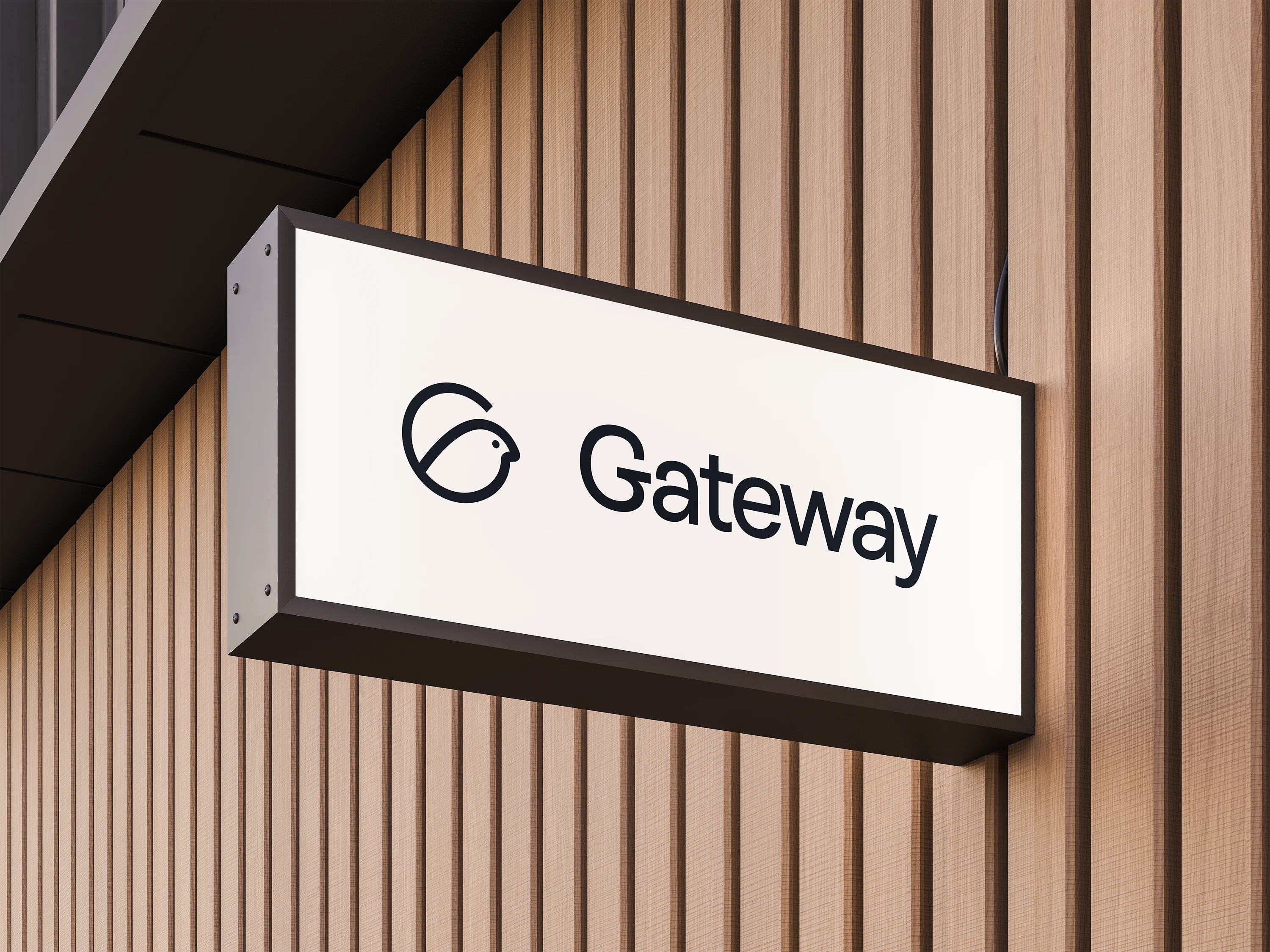
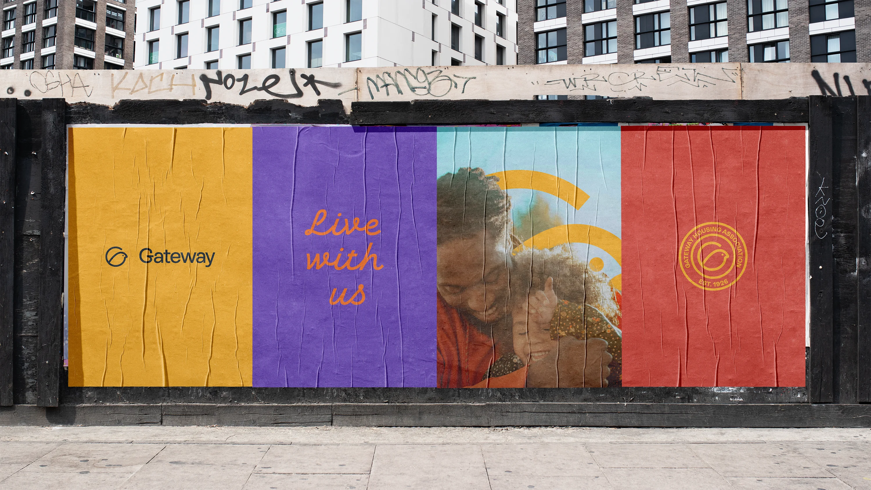
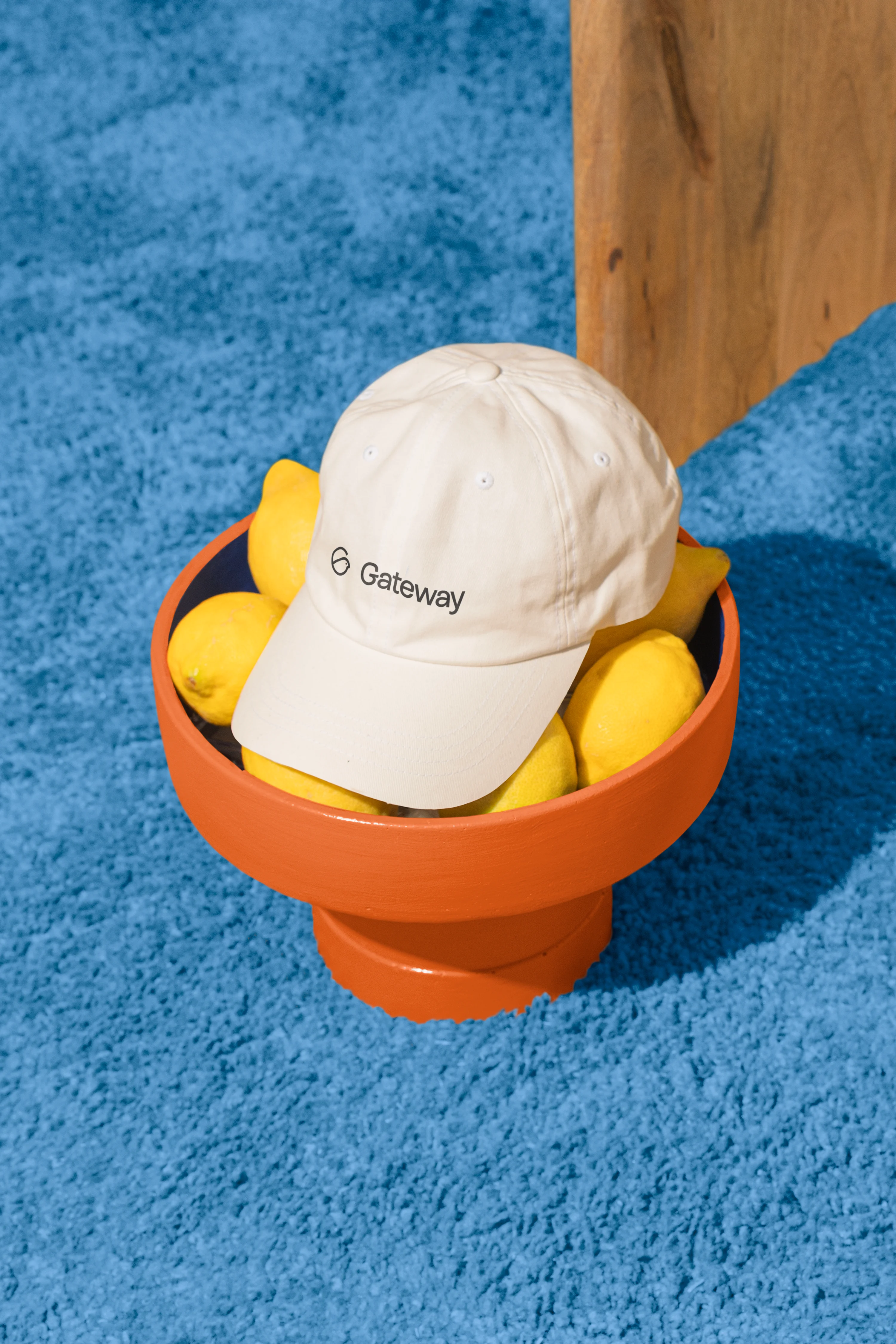
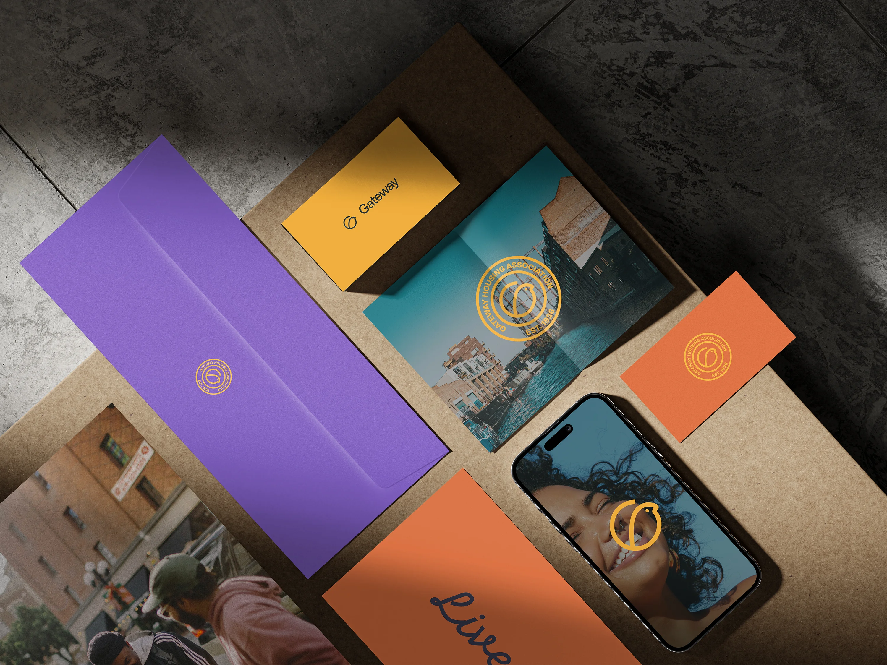
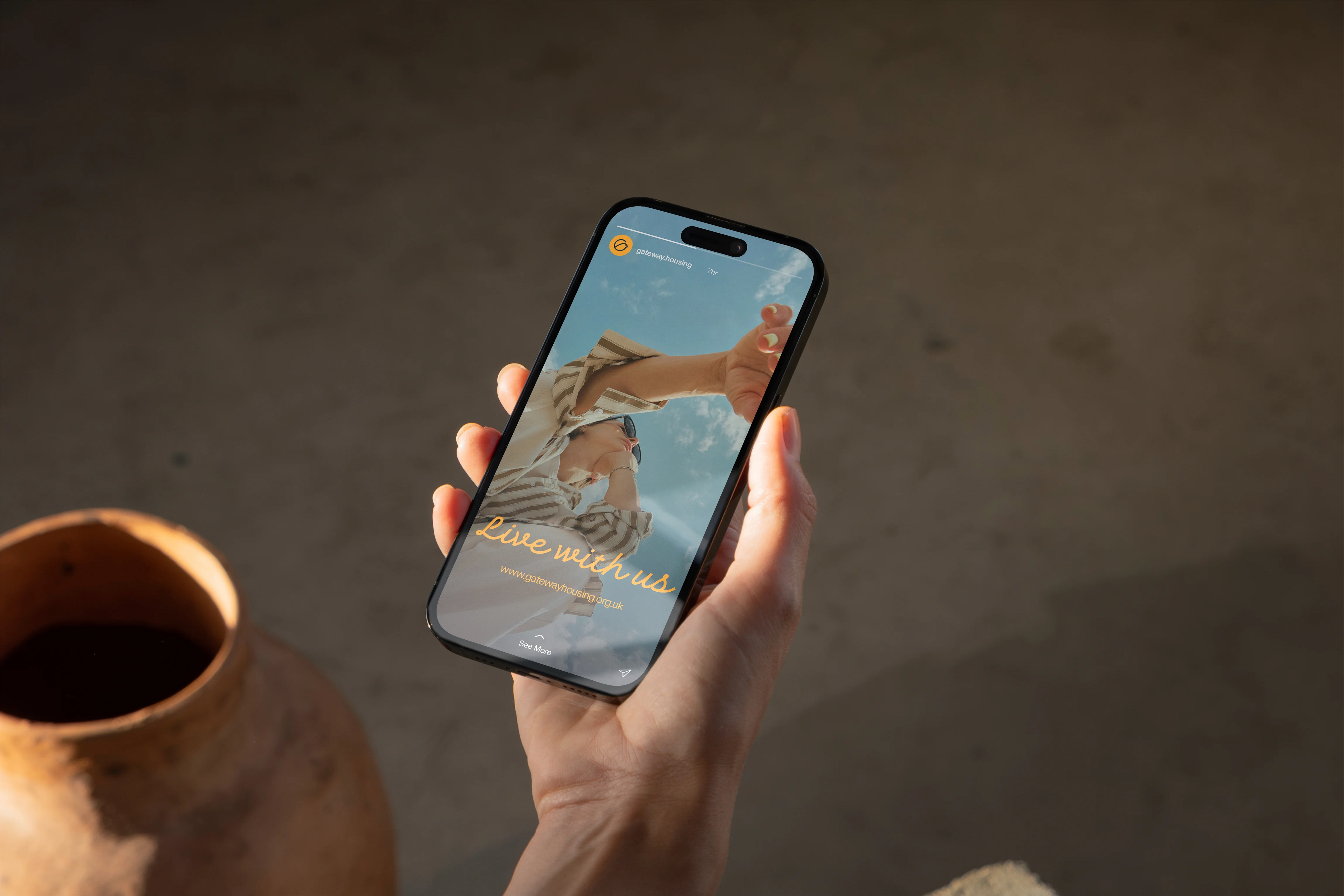
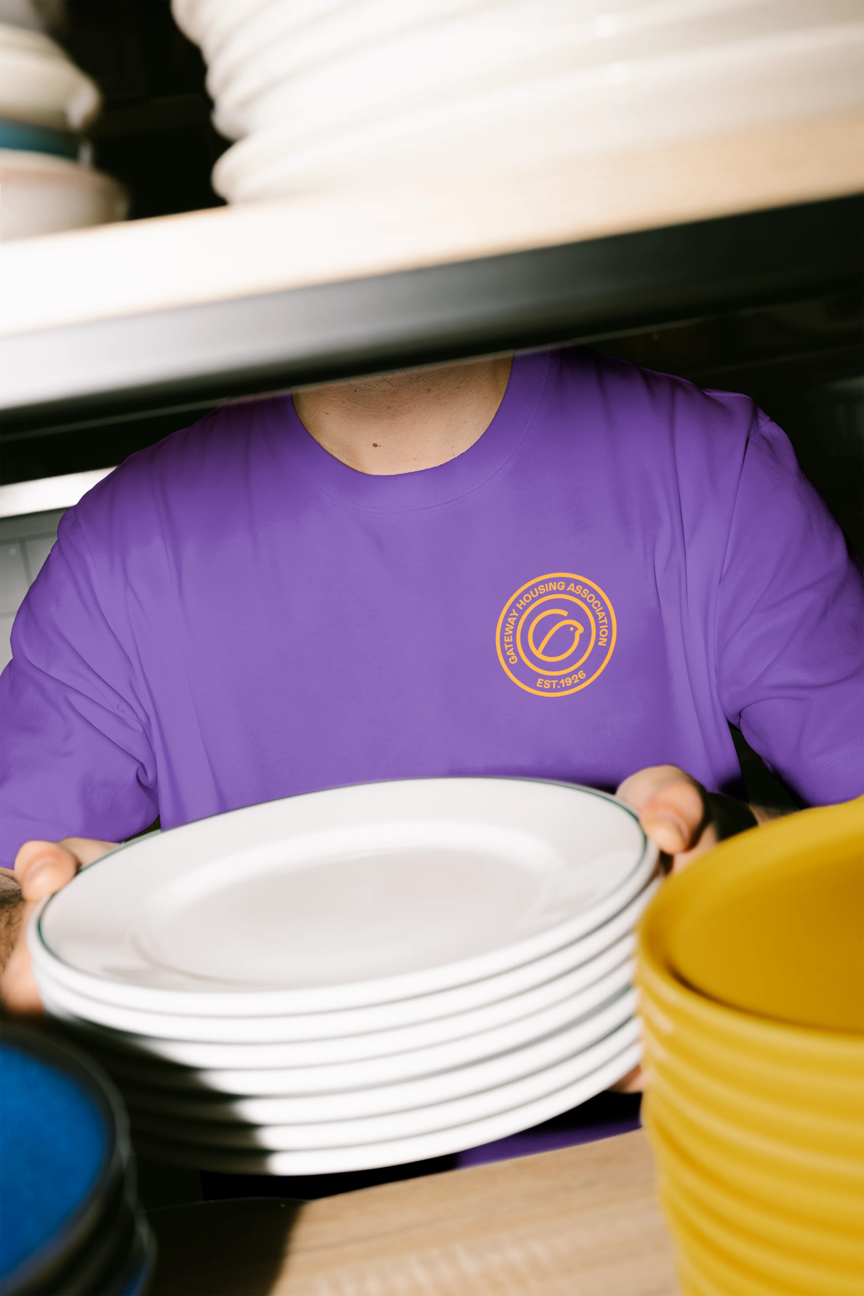
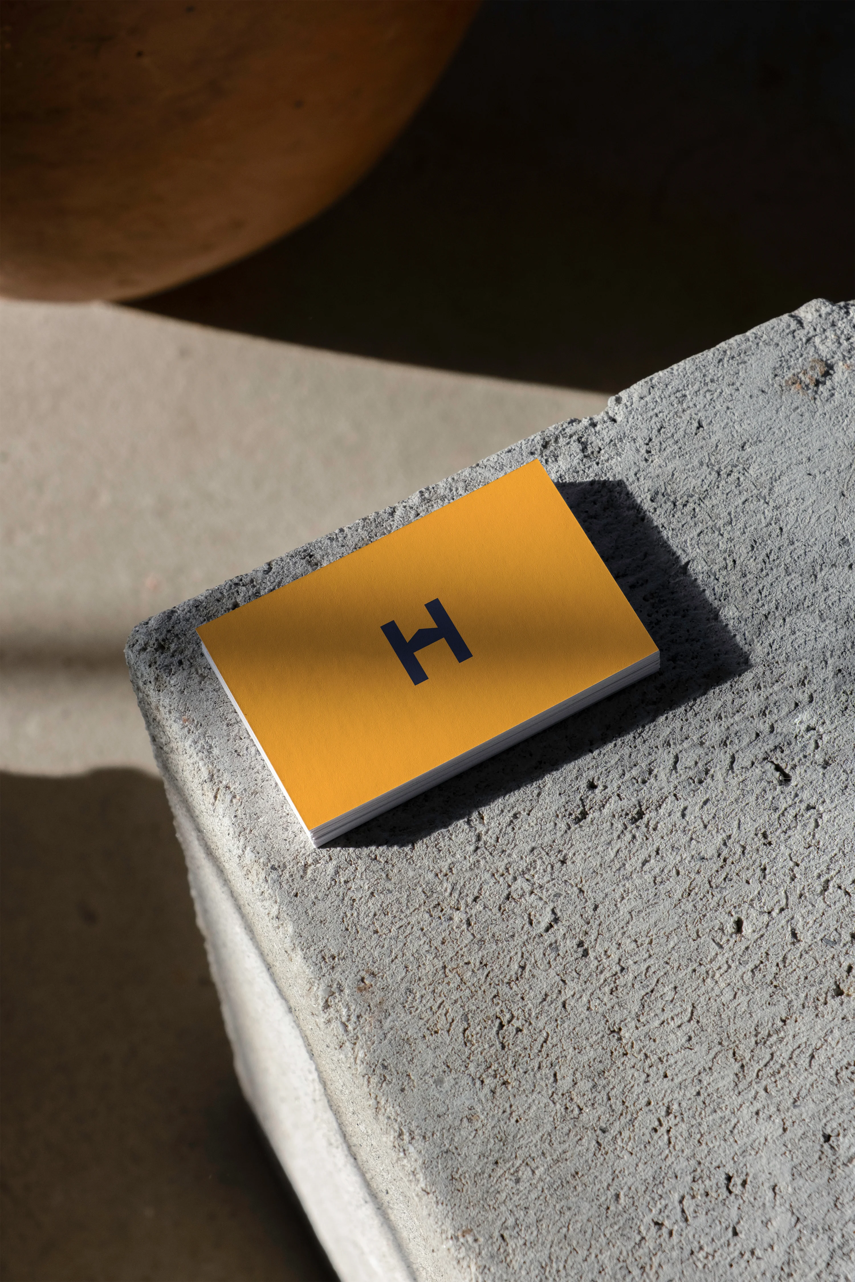
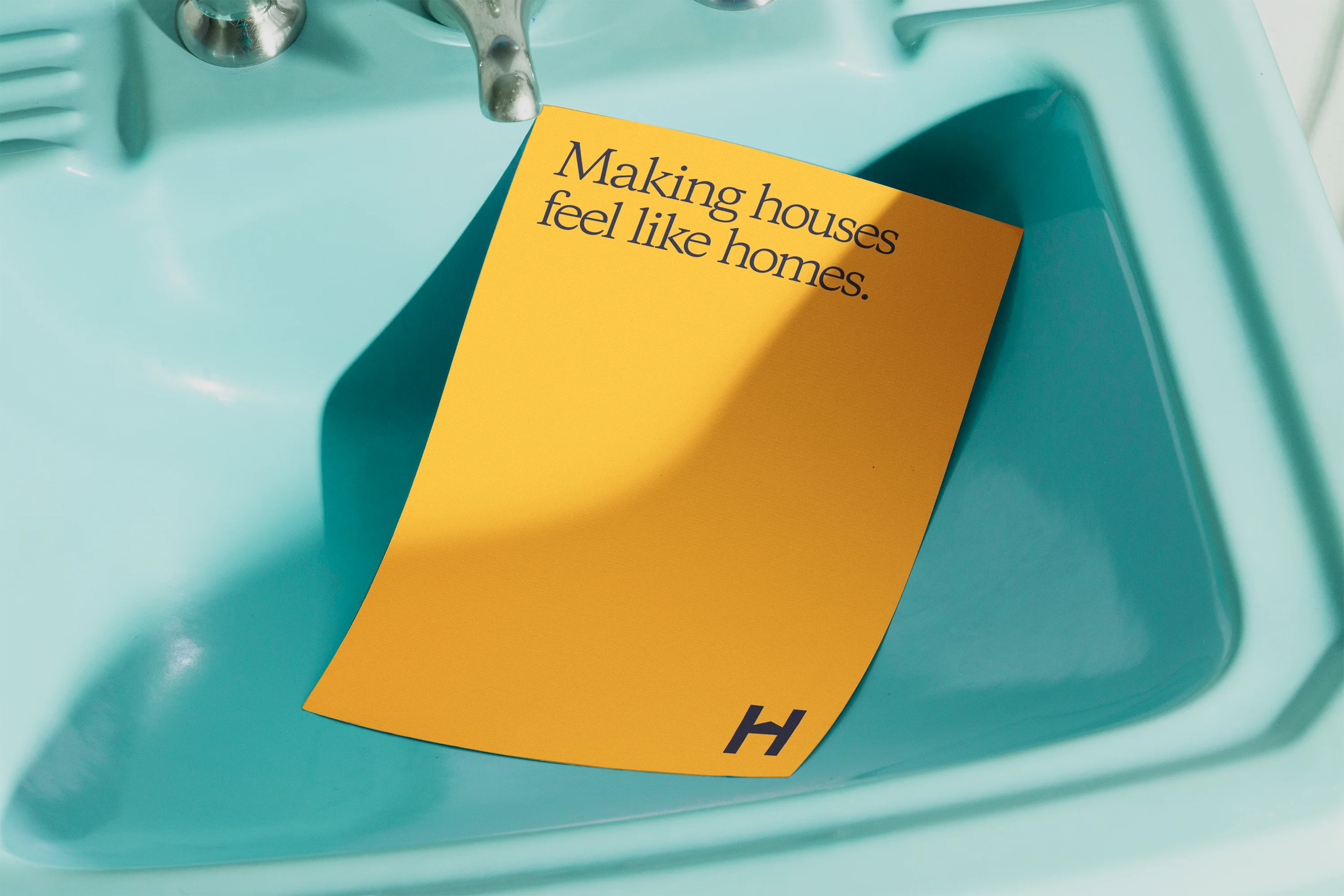
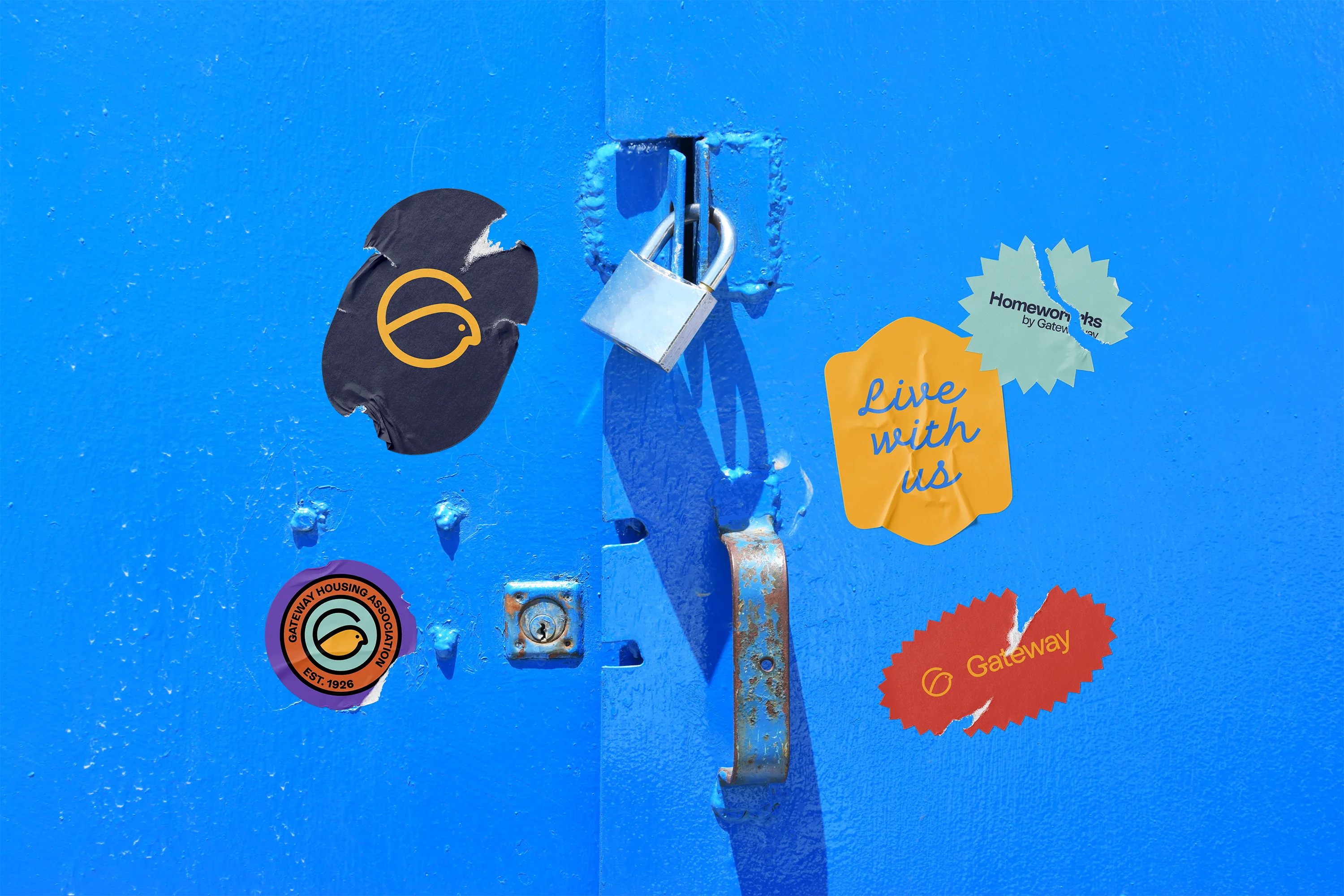
The Cockney sparrow. Small, loud, resilient, and unmistakably East End. A bird that thrives in the city rather than despite it — which turned out to be the closest thing to a description of Gateway's residents we could find. It gave us a mark with a hundred years of local meaning already built in, and one that a five-year-old could draw from memory.The new wordmark was drawn to sit beside it: open, upright, and confident without shouting. Together they hold the line Gateway lives by — Live with us. We then extended the system to Homeworks, Gateway's repairs and maintenance arm. Homeworks is the part of the organisation residents actually meet — the knock at the door, the van on the estate. It needed to read as Gateway at a glance, but stand on its own two feet in workwear and livery.From there, the full suite: signage, business cards, report templates, vehicle livery, t-shirts and a complete social toolkit.